
PowerPoint Charting

All the Charts You Need — All in One Tool
Chart-Tank is the all-in-one charting add-in for PowerPoint and Excel, packed with advanced chart tools like analytical lines, axis breaks, data rows, and import/export.
From timeline planning to market analysis and financial storytelling, Chart-Tank gives you the charts and controls professionals rely on.
Comprehensive Charting Capabilities
Build a variety of charts to suit your needs, including:
- Mekko/Marimekko charts
-
Gantt charts
-
Relative Gantt charts
-
Stacked and Cluster bar charts
-
Line and Combination charts
-
Pie and Doughnut charts
-
Bubble and Scatter plots
-
Radar charts and more...
Advanced Charting Features
Take your charts to the next level with features like:
-
Growth Lines and Bar Comparison Lines
-
Segment Comparison Lines and Value lines
-
Data rows, Data columns
-
CAGR (Compound Annual Growth Rate) calculations
-
Axis breaks
-
Export/Import to/from PowerPoint charts
-
Bulk charts updates
-
Productivity tools and more...
Extensive Customization Options
Access to a large number of customizable properties, allowing you to tailor every detail of your charts, such as:
-
Chart color themes aligned with your branding
-
Font styles, sizes, and label placements
-
Axis scaling, gridlines, and tick marks
-
Legend positioning and customization and more...
Easy to use
Chart-Tank’s intuitive design makes it simple to transform raw data into clear, impactful visuals. Whether you're presenting to a small team or a large audience, our PowerPoint charting software ensures your visuals are polished and professional.
Chart-Tank: The Ultimate PowerPoint Charting Software!

Chart Types
-
Gantt
-
Relative Gantt
-
Mekko (Marimekko)
-
Waterfall
-
Stacked Bar
-
Cluster Bar
-
100% Stacked Bar
-
Area and 100% Area
-
Floating Bars
-
Line and Combination
-
Pie and Doughnut
-
Bubble and Scatter
-
Radar
-
Box and Whisker
Options
-
Horizontal Charts
-
Coloring Modes
-
Data Rows
- Data Columns
- Series Grouping
- Series and Bars Sorting
- Data Scaling
- Label Number Formatting
-
Axis Breaks
-
Second Value Axis
-
Gridlines
-
Adjustable Margins
-
Links to Excel Workbook
Analytical Data Lines
-
Value
-
Automatic Average
-
Growth
-
Bar Comparison
-
Segment Comparison
-
Segment Links
-
Vertical
-
Quadrant Lines
-
Regression Lines
Productivity tools
-
Chart Settings management
-
Color Themes management
-
Chart Type conversion
-
Bulk chart update
-
Bulk chart import/export
-
Charts axes scale alignment
-
Charts axes position alignment
-
Shapes alignment and resizing
Gantt Chart
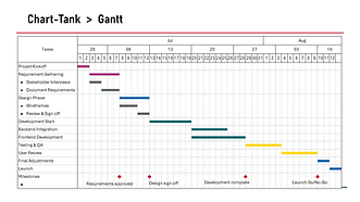
A Gantt chart is a project management tool that displays tasks along a timeline, showing their durations, and dependencies.

Cluster Bar

Cluster bar charts display quantitative data as it changes over time or to illustrate comparisons among items for a given data series, or multiple series.
Stacked Bar

Data in a Stacked chart is arranged vertically to emphasize the variation of change in mixture over time.
100% Stacked Bar

100% Stacked bar charts illustrate comparisons among items while emphasizing the relationship of parts to the whole (bar total value).
Marimekko

Marimekko chart is a variable width 100% stacked bar chart that analyzes multiple data series against the X and Y axes.
Pie and Doughnut

Pie and donut charts are a visual representation of all parts of a whole.
Waterfall (aka Cascade)

A Waterfall chart shows a running total as values are added or subtracted.
Floating Bars

A Floating bar chart is a visual comparison of distribution.
Bubble Chart

A Bubble chart is used to look at relationships between three numeric variables. The values for each data point are horizontal position, vertical position, and size.
Radar (Spider) Chart

A Radar chart displays multivariate data in the form of a two-dimensional chart of three or more quantitative variables represented on axes starting from the same point.